Announcing more powerful Dandi data visualizations

Team Dandi – Oct 23rd, 2024
Spreadsheets can’t do this. The latest Dandi updates make it faster and easier for HR teams to spot trends and discover insights.
Today we're excited to announce new updates to Dandi data visaulizations.
These latest enhancements will save HR teams hours of manual work once spent on creating complex graphs and overlays. Now, you can spend less time in Excel and focus more on crafting data-driven strategies that move your business forward.
New graph overlays: Insights at a glance
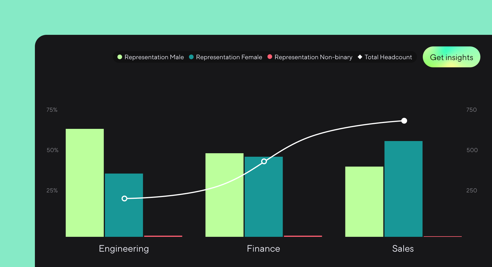
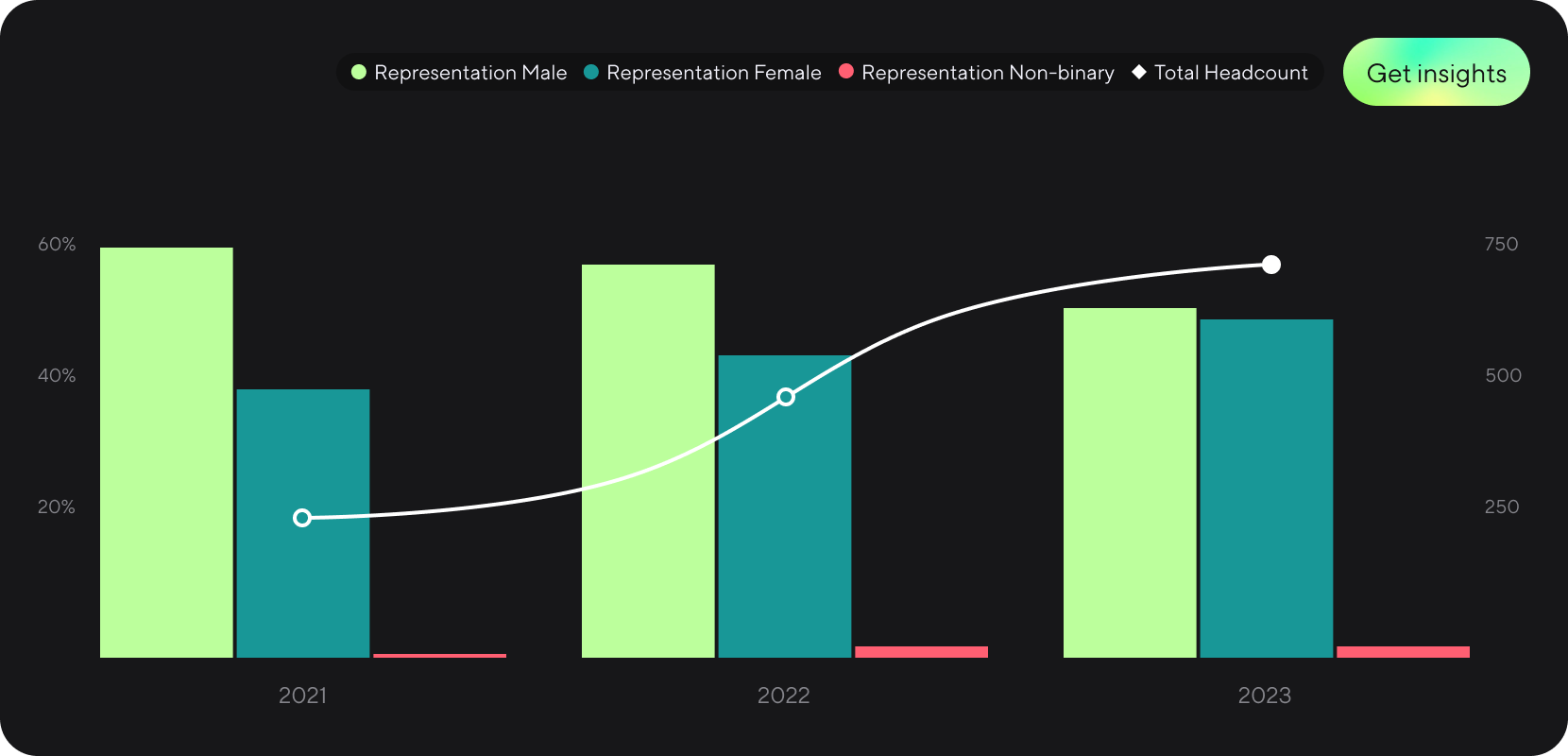
Dandi’s new graph overlays allow you to display two analyses on the same chart, instantly revealing patterns, correlations, and trends across employee segments.
Say you're analyzing gender representation against hiring trends. With Dandi, you can easily visualize both metrics on one chart, instantly revealing correlations that could guide future hiring strategies. It’s a faster, smarter way to get the insights you need.
Key benefits
- Instant trend identification: Easily spot correlations between key employee metrics to make faster, data-driven decisions.
- Improved efficiency: Save hours by having complex visualizations generated instantly, freeing you up to tackle higher-priority tasks.
- Actionable insights: Quickly highlight outliers and anomalies, allowing you to address issues with greater speed and precision.
Configurable x-axis: Easily tailor your visuals
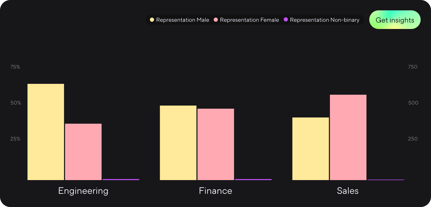
HR data isn’t one-size-fits-all. That’s why we’ve introduced a customizable x-axis, so you can tailor your visualizations to your exact needs.
Imagine you’re analyzing hiring trends across department. With Dandi’s configurable x-axis, you can now easily display departments across the x-axis, allowing you to quickly build the visuals you need to communicate key information to stakeholders.
Key benefits
- Precise analysis: Visualize key metrics that are most relevant to your strategic goals, such as diversity or talent development.
- Deeper insights into employee segments: Easily compare data across different employee groups for more granular reporting and strategic planning.
More powerful analytics features coming
Later this year, we’ll be launching even more advanced analytics features, designed to give HR teams and analysts even greater power and flexibility. Stay tuned for more updates.
Track the metrics that matter. See the 5 essential dashboards for understanding employee experience.
More from the blog
Announcing more powerful Dandi data visualizations
Team Dandi - Oct 23rd, 2024
The New Maturity Model for HR Data
Catherine Tansey - Sep 5th, 2024
Buyer’s Guide: AI for HR Data
Catherine Tansey - Jul 24th, 2024
Powerful people insights, 3X faster
Team Dandi - Jun 18th, 2024
Dandi Insights: In-Person vs. Remote
Catherine Tansey - Jun 10th, 2024
Introducing Dandi AI for HR Data
Team Dandi - May 22nd, 2024
5 essential talent and development dashboards
Catherine Tansey - May 1st, 2024
The people data compliance checklist
Catherine Tansey - Apr 17th, 2024
5 essential EX dashboards
Catherine Tansey - Apr 10th, 2024
Proven strategies for boosting engagement in self-ID campaigns
Catherine Tansey - Mar 27th, 2024
